Thankfully, I caught myself before it was too late. As I've said before, my natural artistic leaning is to just make everything darker. It helps hide any mistakes I've made and I just think it looks better. This is, of course, completely wrong.
For example, take my last post about the Predator. I think it's a great photo with lots of dramatic lighting and mystery. The actual reception has been, well, this, but with my photo in place of the DS. Just because I know what's supposed to be going on doesn't mean the viewer does. The international language is love, not intent.
So this week I want to focus on taking pictures you can actually, you know, see. It'll be a revolutionary process that will most likely change photography forever. Before you know it, people everywhere will start taking pictures of things that will actually appear in the photo!
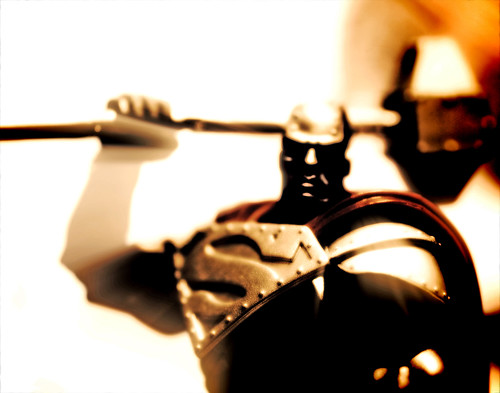
Which brings me to Steel. I wanted to try and recreate a visual style similar to 300 where the lighting is harsh and the shadows are deep, but the details are still visible. Obviously I still have a loooong way to go, but this was interesting enough on it's own that I wanted to post it. Not a whole lot else to say about it other than I think it turned out great and will continue working on it.
Shaquile O'Exif:
| Camera: | Canon EOS Digital Rebel XTi |
| Exposure: | 0.02 sec (1/50) |
| Aperture: | f/2.5 |
| Focal Length: | 50 mm |
| ISO Speed: | 400 |
| Exposure Bias: | 0/3 EV |
| Flash: | Flash did not fire |
| Orientation: | Horizontal (normal) |
| X-Resolution: | 72 dpi |
| Y-Resolution: | 72 dpi |
| Software: | Adobe Photoshop CS3 Windows |
| Date and Time: | 2008:02:22 20:49:43 |
| YCbCr Positioning: | Co-Sited |
| Exposure Program: | Normal |
| Date and Time (Original): | 2008:02:22 20:54:08 |
| Date and Time (Digitized): | 2008:02:22 20:54:08 |
| Shutter Speed: | 369876/65536 |
| Metering Mode: | Pattern |
| Color Space: | sRGB |
| Focal Plane X-Resolution: | 4433.295 dpi |
| Focal Plane Y-Resolution: | 4453.608 dpi |
| White Balance: | Manual |
| Compression: | JPEG |
| Image Width: | 3264 pixels |
| Image Height: | 2592 pixels |
Be good,
-Dave


2 Reply to "Man of Steel"
creativeapples on February 25, 2008 at 10:22 AM
i think this turned out great! I love the shaft of light that you see thru his arm and how prominent the steel "s" symbol on his chest is!
bravo!!!
David A Price on February 25, 2008 at 5:27 PM
It's kinda Mignola-esque.
Leave a Comment