6:12 PM by
El Dave
, under

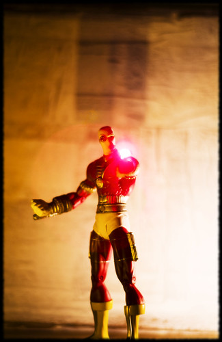
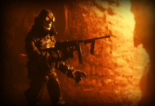
Taking a break from building props, I was curious how well the lightbox would reflect light from inside the box as opposed to clamping desk lamps around and diffusing light from the outside (I'm not entirely sure why I wanted to know). For lighting I grabbed one of those LED tealights and another LED bulb I had lying around, and placed them near the sides of the lightbox. The bounce from the LED bulb created that great flare on the bottom left, while the LED tealight lit Deadshot in a pale yellow. The barrel was lit with a laser pointer.
In case you're curious just who Deadshot is, here's a brief synopsis from Wikipedia (because they're always right):
Within the context of the DC Comics universe, Deadshot is often a hired assassin, regularly boasting to "never miss." He is capable of using a large variety of weapons, but prefers using a pair of silenced, wrist-mounted guns. He initially appeared in Gotham City as a new crimefighter, but was revealed to be an enemy of Batman when he attempted to replace the Dark Knight. When this plan failed, he attempted to become king of Gotham's Underworld. Batman and Commissioner Gordon publicly exposed his plot, and he went to jail.
His story obviously continues from there. I highly recommend checking out any collected editions of the Suicide Squad to see more of Deadshot, along with the recent Countdown to Final Crisis and assorted tie-ins, where Deadshot and the rest of the Suicide Squad play a small but important role.
Seriously. Go read it. There will be a test.
You don't want to disappoint a guy named Deadshot, do you?
EXIF at dawn:
| Camera: | Fujifilm FinePixS2Pro |
| Exposure: | 0.7 sec (7/10) |
| Aperture: | f/1.8 |
| Focal Length: | 50 mm |
| ISO Speed: | 100 |
| Exposure Bias: | 1 EV |
| Orientation: | Horizontal (normal) |
| X-Resolution: | 72 dpi |
| Y-Resolution: | 72 dpi |
| Software: | Adobe Photoshop CS3 Windows |
| Date and Time: | 2008:01:31 19:53:18 |
| Tag::TIFF::0x882A: | -6, -6 |
| Exposure Program: | Manual |
| Date and Time (Original): | 2008:01:31 19:48:23 |
| Date and Time (Digitized): | 2008:01:31 19:48:23 |
| Shutter Speed: | 514573/1000000 |
| Brightness: | 100/100 |
| Metering Mode: | Center Weighted Average |
| Color Space: | Uncalibrated |
| Focal Plane X-Resolution: | 630 dpc |
| Focal Plane Y-Resolution: | 630 dpc |
| Sensing Method: | One-chip colour area sensor |
| Exposure Mode: | Manual |
| Focal Length In 35mm Film: | 75 |
| Saturation: | High saturation |
| Compression: | JPEG |
| Image Width: | 1965 pixels |
| Image Height: | 3024 pixels |
Be good,
-Dave
|


7:24 PM by
El Dave
, under

Hey, fun drinking game. Every time I mention "Stormtrooper" you take a drink. Challenge your friends!
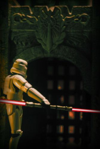
I have a fondness for variations on a theme. Take Star Wars for example. Well, Stormtroopers to be specific. To me, they are a nearly inexhaustible well of ideas to play off of. Need an interesting story hook? Why not throw in some Stormtroopers. Want a unique character idea? Stormtrooper. When we used to play the Star Wars RPG, I created Jub Jub, the Ewok Stormtrooper. My current project is TK-182, the Force Sensitive Stormtrooper. My goal is to get a couple more Stormtroopers and repaint/redeco them into Light and Dark Side appropriate costumes.
What? I think a lightsaber-wielding Stormtrooper would be AWESOME. Picture Darth Maul with a Stormtrooper helmet. I knew you'd see it my way.
Ok, like I mentioned in my last post, I want to start using more props and less backdrops. Today I'm using a castle piece from my old tabletop gaming days that I found while cleaning out the closet. This time I went back to the stovetop, but only because I used candles to light the shot. I just don't have any lightbulbs that produce that amount of light, and I can't put a candle in the lightbox.
My posts may be sporadic while I'm building props, so please bear with me. I will definitely keep taking pictures, but they may not all be the quality I'd like.
If you strike me down, I will become more EXIF than you can imagine:
| Camera: | Fujifilm FinePixS2Pro |
| Exposure: | 1.5 sec (3/2) |
| Aperture: | f/5.6 |
| Focal Length: | 79 mm |
| ISO Speed: | 100 |
| Exposure Bias: | -1 EV |
| Orientation: | Horizontal (normal) |
| X-Resolution: | 72 dpi |
| Y-Resolution: | 72 dpi |
| Software: | Adobe Photoshop CS3 Windows |
| Date and Time: | 2008:01:29 21:13:18 |
| Tag::TIFF::0x882A: | -6, -6 |
| Exposure Program: | Shutter priority |
| Date and Time (Original): | 2008:01:29 20:47:03 |
| Date and Time (Digitized): | 2008:01:29 20:47:03 |
| Shutter Speed: | -584963/1000000 |
| Brightness: | -216/100 |
| Metering Mode: | Center Weighted Average |
| Color Space: | Uncalibrated |
| Focal Plane X-Resolution: | 630 dpc |
| Focal Plane Y-Resolution: | 630 dpc |
| Sensing Method: | One-chip colour area sensor |
| Exposure Mode: | Auto bracket |
| Focal Length In 35mm Film: | 118 |
| Saturation: | High saturation |
| Compression: | JPEG |
| Image Width: | 2024 pixels |
| Image Height: | 3024 pixels |
Be good,
-Dave
(Stormtrooper)
|


10:02 AM by
El Dave
, under

Every once in a while, as a way to save money, I like to go back and reshoot toys that I've had for awhile and used when I was really trying to discover where I wanted to go as a photographer. This has two distinct benefits beyond obviously helping my wallet (it's the Blue Demon one); 1) I have a way to measure how far I've come and 2) It keeps April from killing me due to the large number of toys floating around the apartment.
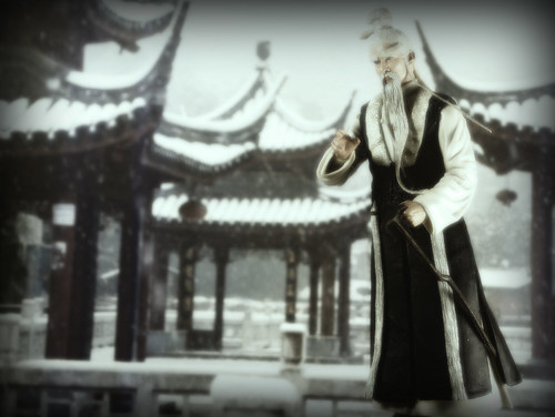
Let's take a look at the original.

The first things that stick out to me is that the figures are in stark contrast to their backdrops. In the most recent, the pagodas are extremely bokeh'd, while Pei Mei himself is in sharp focus. That does not a good toy picture make. I'm wondering if next time I should move the figure closer to the backdrop or if next time use a background that is more defined?
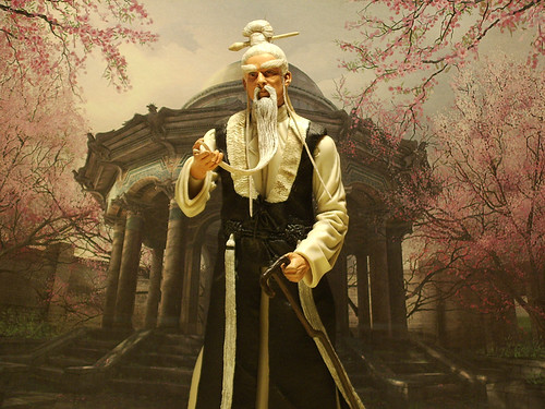
But that brings me to the problem I have with the second photo; both the character and background are crystal clear (not to mention the background is from a video game. My bad). So much so that you can tell they are two distinct things. I suppose a slight Gaussian blur in Photoshop would take care of that, but it's still hard to shake the fact that both are in equal focus. The viewer has no sense of perspective relative to Pei Mei or the temple, and I'm not convinced that a little blur would completely fix it.
I'm left with the notion that, despite my reluctance, I'm going to have to start building sets. If I want Pei Mei to stand in front of a temple surrounded by trees, I'm going to have to create that world. Doing so gives me a lot of freedom in how I set up my shot and lets me flex some different creative muscles that have been sadly wasting away these past few years. I used to be fairly good at it, though.
So what has all this taught me?
I need more practice.
Background provided by Steve Webel through a Creative Commons license
Be good,
-Dave
|


5:56 PM by
El Dave
, under

First off, I just want to say that all my photos are now available under an Attribution Non-Commerical ShareAlike Creative Commons License. What that means is, everyone is free to take my photographs and do things with them. Want to display them? Cool. Want to draw mustaches over the character's faces? Awesome. Want to sell my photos? Ain't happening. All I ask is to be credited with a link back to this blog. You can read a better description of what this Creative Commons License means here.
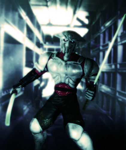
Now that all the formal stuff is finished, Lightbox Fest '08 continues unabated! After a trip to Quake Collectables here in Chicago, we came home one Yoshimitsu heavier than when we left. FUN FACT: April and I have a heated rivalry when it comes to Tekken. She thinks her cheap-assed, drunken boxing, Jackie Chan-wannabe, Lei Wulong has a chance against the virtuous Champion of Good, King. I let her win the occasional game, of course, but she takes it as an opportunity to smear my good name with her trash talk. And boy can she talk some trash.
One of the things I noticed about Tekken 5 was not only how gorgeous it is, but the soft glow that everything seems to have. It makes for a great gaming experience, but, after seeing other games pick up on it (I'm looking at you Halo), it starts to get ridiculous. While shooting Yoshimitsu, I wanted to try and recreate the Tekken 5 glow, but see if I could push the boundaries of ridiculous.
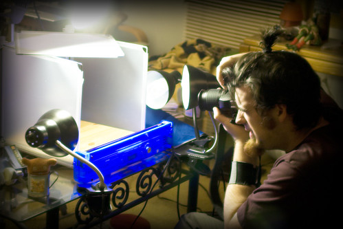
Setup for today was, well, why don't I just show you? Look ma, no stove!

Round 1...EXIF!
| Camera: | Fujifilm FinePixS2Pro |
| Exposure: | 0.25 sec (1/4) |
| Aperture: | f/4.5 |
| Focal Length: | 50 mm |
| ISO Speed: | 100 |
| Exposure Bias: | 1 EV |
| Orientation: | Horizontal (normal) |
| X-Resolution: | 72 dpi |
| Y-Resolution: | 72 dpi |
| Software: | Adobe Photoshop CS3 Windows |
| Date and Time: | 2008:01:26 19:50:55 |
| Tag::TIFF::0x882A: | -6, -6 |
| Exposure Program: | Normal |
| Date and Time (Original): | 2008:01:26 19:08:22 |
| Date and Time (Digitized): | 2008:01:26 19:08:22 |
| Shutter Speed: | 2/1 |
| Brightness: | 233/100 |
| Metering Mode: | Center Weighted Average |
| Color Space: | Uncalibrated |
| Focal Plane X-Resolution: | 630 dpc |
| Focal Plane Y-Resolution: | 630 dpc |
| Sensing Method: | One-chip colour area sensor |
| Exposure Mode: | Auto bracket |
| Focal Length In 35mm Film: | 75 |
| Saturation: | High saturation |
| Compression: | JPEG |
| Image Width: | 1732 pixels |
| Image Height: | 2058 pixels |
Background provided by autowitch through a Creative Commons licenseBe good,
-Dave
|


5:44 PM by
El Dave
, under

I am a fool. There, I said it.
For the two years (give or take) I've been a toy photographer, I've resisted using a lightbox. Of course, I had great reasons to not use one.
1) It isn't really safe to start a fire in the lightbox
2) The smoke machine is a pain to operate as it is
3) I am a fool
Seeing that I am a fool, it should surprise no one that we already have a "professional" lightbox around the house. I bought it for April a few years ago as a Christmas gift and she didn't like using it and I wasn't comfortable with it so it has sat, unloved against the wall. Poor lightbox.
My friend Adam, knowing that my studio consists of the stove top (and secretly pitying me for it), pointed us to a great Shelving Unit that was so affordable that we couldn't really resist. We got it assembled and I finally got up the nerve to play with it.
I am a fool. Please forgive me, Oh Lightbox!
EXIFbox data:
| Camera: | Fujifilm FinePixS2Pro |
| Exposure: | 0.125 sec (1/8) |
| Aperture: | f/5.3 |
| Focal Length: | 66 mm |
| ISO Speed: | 100 |
| Exposure Bias: | -1 EV |
| Orientation: | Horizontal (normal) |
| X-Resolution: | 72 dpi |
| Y-Resolution: | 72 dpi |
| Software: | Adobe Photoshop CS3 Windows |
| Date and Time: | 2008:01:25 19:39:51 |
| Tag::TIFF::0x882A: | -6, -6 |
| Exposure Program: | Normal |
| Date and Time (Original): | 2008:01:25 19:29:29 |
| Date and Time (Digitized): | 2008:01:25 19:29:29 |
| Shutter Speed: | 3/1 |
| Brightness: | 166/100 |
| Metering Mode: | Center Weighted Average |
| Color Space: | Uncalibrated |
| Focal Plane X-Resolution: | 630 dpc |
| Focal Plane Y-Resolution: | 630 dpc |
| Sensing Method: | One-chip colour area sensor |
| Exposure Mode: | Auto bracket |
| Focal Length In 35mm Film: | 99 |
| Saturation: | High saturation |
| Compression: | JPEG |
| Image Width: | 2976 pixels |
| Image Height: | 2024 pixels |
Background provided by dgphilli through a Creative Commons licenseBe good,
-Dave
|


7:37 PM by
El Dave
, under

I think it's fair to say that I really only have one objective with my toy shots, and that is to make you the viewer forget, even for a second, that you are looking at a toy. That isn't saying much when it comes to McFarlane Toys and their amazing detail and few points of articulation, but when I'm dealing with a Mattel or Hasbro-like figure it becomes a much greater challenge. Some days it doesn't work and others (like today) everything just falls smoothly into place.
When I first set this up, I had no idea how it would turn out. Out of all the shots I've done, this had the most tear down and build because I really had no clue what I was going for. I'd move the prop, reposition the figure, set my lights, focus, not like what I see so I tear it all down and start again. While I'm still not certain what exactly is going on, I really do love how it turned out. Somehow, in my Zen-like inability to consciously build a good set, I managed to come away with one that I really dig.
EXIF are a superstitious and cowardly lot:
| Camera: | Fujifilm FinePixS2Pro |
| Exposure: | 0.333 sec (1/3) |
| Aperture: | f/1.8 |
| Focal Length: | 50 mm |
| ISO Speed: | 100 |
| Exposure Bias: | -1 EV |
| Orientation: | Horizontal (normal) |
| X-Resolution: | 72 dpi |
| Y-Resolution: | 72 dpi |
| Software: | Adobe Photoshop CS3 Windows |
| Date and Time: | 2008:01:23 21:25:08 |
| Tag::TIFF::0x882A: | -6, -6 |
| Exposure Program: | Normal |
| Date and Time (Original): | 2008:01:23 21:18:33 |
| Date and Time (Digitized): | 2008:01:23 21:18:33 |
| Shutter Speed: | 1584963/1000000 |
| Brightness: | -233/100 |
| Metering Mode: | Center Weighted Average |
| Color Space: | Uncalibrated |
| Focal Plane X-Resolution: | 630 dpc |
| Focal Plane Y-Resolution: | 630 dpc |
| Sensing Method: | One-chip colour area sensor |
| Exposure Mode: | Auto bracket |
| Focal Length In 35mm Film: | 75 |
| Saturation: | High saturation |
| Compression: | JPEG |
| Image Width: | 1905 pixels |
| Image Height: | 2340 pixels |
Be good,
-Dave
|


8:49 PM by
El Dave
, under

My unannounced and unacknowledged competition with McFarlane's catalog continues unabated and, um, un- ...heeded? Yeah, that'll do.
When I realized that companies might not want photos of their figures surrounded by fog or engulfed in flames, I decided that I should continue focusing on portraits that showed all the fun details of the figure, but with my own style. Well, that's not entirely true. First I curled up into a ball and cried and cried and cried.
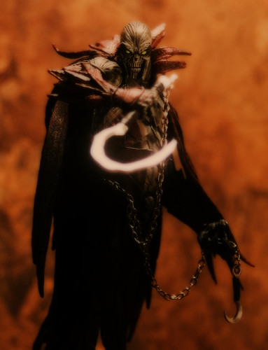
Which brings us to Spawn. I shot him exactly like I did with Lilith, with the stove light/reflected flashlight combo. As much as I love the figure, that sickle is a pain to work with. It's just narrow enough that you have to have it facing the camera or else you can't see it, and it's supposed to be metal, but the paint they use is a bit too reflective and it looks like it just might be radioactive.
You know what I just realized? I've become that guy. I can accept the fact that my subject is the larval form of the General of Hell's army, but his thin plastic knife that reflects too much light? UNACCEPTABLE.
I need to go lie down. Maybe read a book. Maybe even leave the house.
Help?
Gone, gone EXIF of man:
| Camera: | Fujifilm FinePixS2Pro |
| Exposure: | 4 sec (4) |
| Aperture: | f/4.8 |
| Focal Length: | 53 mm |
| ISO Speed: | 100 |
| Exposure Bias: | 1 EV |
| Orientation: | Horizontal (normal) |
| X-Resolution: | 72 dpi |
| Y-Resolution: | 72 dpi |
| Software: | Adobe Photoshop CS3 Windows |
| Date and Time: | 2008:01:21 22:47:45 |
| Tag::TIFF::0x882A: | -6, -6 |
| Exposure Program: | Normal |
| Date and Time (Original): | 2008:01:21 22:30:08 |
| Date and Time (Digitized): | 2008:01:21 22:30:08 |
| Shutter Speed: | -2/1 |
| Brightness: | -116/100 |
| Metering Mode: | Center Weighted Average |
| Color Space: | Uncalibrated |
| Focal Plane X-Resolution: | 630 dpc |
| Focal Plane Y-Resolution: | 630 dpc |
| Sensing Method: | One-chip colour area sensor |
| Exposure Mode: | Auto bracket |
| Focal Length In 35mm Film: | 79 |
| Saturation: | High saturation |
| Compression: | JPEG |
| Image Width: | 1444 pixels |
| Image Height: | 1884 pixels |
Be good,
-Dave
|


4:37 PM by
El Dave
, under

I'm just going to come out and say it. Whoever is the guy that takes the photographs for McFarlane toys? I want your job. I'm sure you have loads of other duties and responsibilities around the office, but watch your back. I make a mean cup of coffee and I'm not completely useless in front of a copier, either. I'm coming for you, baby!
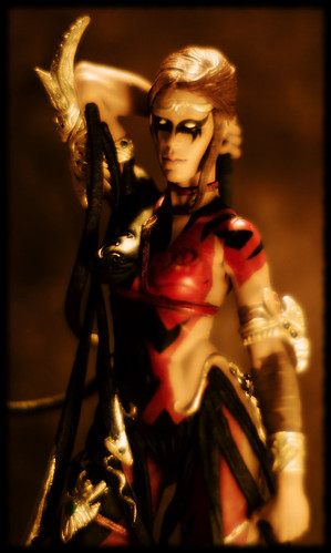
That brings us to today's photo of Lilith. I've been watching the 365 Days video podcast and it's made me think about how I approach my toy portraits. Chris Maverick has a fantastic tutorial about his lighting set up and I really wanted to try and apply some of his techniques to my toy photos.
My setup wasn't all that elaborate, but I built a reflector out of aluminum foil to help balance out the shadows and bring the whole figure a much richer color and clarity. I just bounced a regular pocket flashlight off the reflector and clicked the shutter. It took a couple of tries, but I'm really, really pleased with how it looks so far. Taking it into Photoshop, I only played with the contrast a little and added the glow for the painted look that I like so much, and Save As.
Now if I could only shoot people like this!
Four score and EXIF years ago:
| Camera: | Fujifilm FinePixS2Pro |
| Exposure: | 0.333 sec (1/3) |
| Aperture: | f/1.8 |
| Focal Length: | 50 mm |
| ISO Speed: | 100 |
| Exposure Bias: | -1 EV |
| Orientation: | Horizontal (normal) |
| X-Resolution: | 72 dpi |
| Y-Resolution: | 72 dpi |
| Software: | Adobe Photoshop CS3 Windows |
| Date and Time: | 2008:01:16 18:29:51 |
| Tag::TIFF::0x882A: | -6, -6 |
| Exposure Program: | Normal |
| Date and Time (Original): | 2008:01:16 18:17:39 |
| Date and Time (Digitized): | 2008:01:16 18:17:39 |
| Shutter Speed: | 1584963/1000000 |
| Brightness: | -266/100 |
| Metering Mode: | Center Weighted Average |
| Color Space: | Uncalibrated |
| Focal Plane X-Resolution: | 630 dpc |
| Focal Plane Y-Resolution: | 630 dpc |
| Sensing Method: | One-chip colour area sensor |
| Exposure Mode: | Auto bracket |
| Focal Length In 35mm Film: | 75 |
| Saturation: | High saturation |
| Compression: | JPEG |
| Image Width: | 1211 pixels |
| Image Height: | 2022 pixels |
Be good,
-Dave
|


4:23 PM by
El Dave
, under

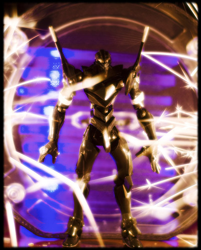
It's amazing how different people can push and prod you into trying something different. My buddy Adam (who originally gave me Unit-03) posted this photo of Snake Eyes. He says he needs to reshoot it, but he's wrong, because he got it right the first time!
Not only is it a great photo, it inspired me to start looking at backdrops differently. I've been wanting to build sets for my figures, but he's convinced me that I don't have to build anything; I just need to change how I look at what's already around me.
That leads us to today's photo. I began by removing the foam and plastic cover from our stereo's speaker and turning it backwards so the cool plasticy bits served as a frame for Unit-03. Then I grabbed my Ikea Tybble Lamp and used it to prop up the speaker cover. All that was left was to light the sparklers (I found another box of them, yay!) and shoot like mad. Cleanup in Photoshop was the normal color/contrast tweaks.
EDIT: Now I know what this reminds me of! This is totally a wrestling entrance stage; all I need is a way to capture cheesy guitar riffs with my camera. God, I'm a hack.
Into the flood again, same ol' EXIF it was back then:
| Camera: | Fujifilm FinePixS2Pro |
| Exposure: | 0.1 sec (1/10) |
| Aperture: | f/1.8 |
| Focal Length: | 50 mm |
| ISO Speed: | 100 |
| Exposure Bias: | 1 EV |
| Orientation: | Horizontal (normal) |
| X-Resolution: | 72 dpi |
| Y-Resolution: | 72 dpi |
| Software: | Adobe Photoshop CS3 Windows |
| Date and Time: | 2008:01:15 18:18:14 |
| Tag::TIFF::0x882A: | -6, -6 |
| Exposure Program: | Normal |
| Date and Time (Original): | 2008:01:15 18:03:44 |
| Date and Time (Digitized): | 2008:01:15 18:03:44 |
| Shutter Speed: | 3321928/1000000 |
| Brightness: | 116/100 |
| Metering Mode: | Center Weighted Average |
| Color Space: | Uncalibrated |
| Focal Plane X-Resolution: | 630 dpc |
| Focal Plane Y-Resolution: | 630 dpc |
| Sensing Method: | One-chip colour area sensor |
| Exposure Mode: | Auto bracket |
| Focal Length In 35mm Film: | 75 |
| Saturation: | High saturation |
| Compression: | JPEG |
| Image Width: | 2024 pixels |
| Image Height: | 3024 pixels |
Be good,
-Dave
|


9:34 AM by
El Dave
, under

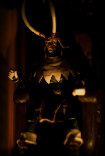
Since my last post, I've been stuck in a bit of a creative slump. Apparently, not being able to take a picture of a Frankenmonkey really knocked the wind out of my sails and I've been extremely dissatisfied with all the shots I've taken in the days since. Thankfully, Loki came along and saved me from a nasty case of Photographer's Block!
When I first set this one up, I wanted to go for Conan-esque scene, where Loki sat slumped on Odin's throne. Due to the figure's front and back loincloth, that didn't quite work out, so I had to try something different. While reposing him (and fighting with that freaking loincloth all over again), it struck me how much he really just looked like a toy. I mean, more than he already does. His joints are really obvious, his hands are twisted in the kung fu grip and, overall, he just doesn't have that much of a range of motion. I couldn't pose him in anything close to what I imagined without it looking like he was punching himself in the face!
With that revelation came the solution. If he's going to look like a toy regardless, why not shoot him like a toy? Having recently visited the House on the Rock, I tried to recreate the penny arcade clockwork machines they have on display. You put the coin in and the puppets do their little movements to a short music clip? I'm sure you've seen them? Go ask your grandparents, they'll know.
I moved the tripod down and shifted to the right to capture Loki at an odd angle where his obvious toyness would be accentuated. I hid his joints as best I could by only using two tea light candles for lighting and moving them towards the front of the figure so his back (and many joints) would be in shadow. All that was left was to play around with the aperture to get the light how I wanted and snap off the shot. Cleanup in Photoshop was just a simple contrast and highlight job, add the vignette, and upload to Flickr.
Insert coin for EXIF Data:
| Camera: | Fujifilm FinePixS2Pro |
| Exposure: | 0.125 sec (1/8) |
| Aperture: | f/1.8 |
| Focal Length: | 50 mm |
| ISO Speed: | 100 |
| Exposure Bias: | -1 EV |
| Orientation: | Horizontal (normal) |
| X-Resolution: | 72 dpi |
| Y-Resolution: | 72 dpi |
| Software: | Adobe Photoshop CS3 Windows |
| Date and Time: | 2008:01:13 11:29:09 |
| Tag::TIFF::0x882A: | -6, -6 |
| Exposure Program: | Shutter priority |
| Date and Time (Original): | 2008:01:13 10:41:31 |
| Date and Time (Digitized): | 2008:01:13 10:41:31 |
| Shutter Speed: | 3/1 |
| Brightness: | -366/100 |
| Metering Mode: | Center Weighted Average |
| Color Space: | Uncalibrated |
| Focal Plane X-Resolution: | 630 dpc |
| Focal Plane Y-Resolution: | 630 dpc |
| Sensing Method: | One-chip colour area sensor |
| Exposure Mode: | Auto bracket |
| Focal Length In 35mm Film: | 75 |
| Saturation: | High saturation |
| Compression: | JPEG |
| Image Width: | 2024 pixels |
| Image Height: | 3024 pixels |
Be good,
-Dave
|


2:17 PM by
El Dave
, under

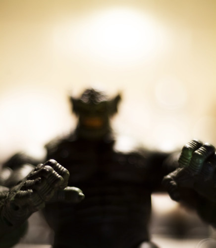
I should subtitle this "When in doubt, Photoshop the crap out of it". I had a really great idea for ol' War Ape here, but I don't have any more sparklers (used them all in a shoot that didn't turn out), I don't have a way to safely produce arcs of electricity (haven't built that Jacob's Ladder), and he's so tall (relatively speaking) that any fire I used just didn't work out.
Call it an exercise in creative frustration.
I originally envisioned a scene with lots of sparks, some smoke, a little fire, a glint in the monster's eye; you know, Frankenstein. I wanted something that was as much fun to set up as it would be to shoot. What I settled for is a barely aggressive pose shot against a plain background. After about an hour and a half of heavy Photoshop work, what was originally a boring portrait of a gorilla is a little closer to what I originally intended. The photo looks old, it looks dusty, it looks like something a mad scientist would come up with and, for now, that's good enough. I'll definitely be shooting Mr. War Ape again!
Frankenexif's monster:
| Camera: | Fujifilm FinePixS2Pro |
| Exposure: | 0.7 sec (7/10) |
| Aperture: | f/1.8 |
| Focal Length: | 50 mm |
| ISO Speed: | 100 |
| Exposure Bias: | 1 EV |
| Orientation: | Horizontal (normal) |
| X-Resolution: | 72 dpi |
| Y-Resolution: | 72 dpi |
| Software: | Adobe Photoshop CS3 Windows |
| Date and Time: | 2008:01:10 16:09:45 |
| Tag::TIFF::0x882A: | -6, -6 |
| Exposure Program: | Normal |
| Date and Time (Original): | 2008:01:10 15:47:34 |
| Date and Time (Digitized): | 2008:01:10 15:47:34 |
| Shutter Speed: | 514573/1000000 |
| Brightness: | -133/100 |
| Metering Mode: | Center Weighted Average |
| Light Source: | Daylight |
| Color Space: | Uncalibrated |
| Focal Plane X-Resolution: | 630 dpc |
| Focal Plane Y-Resolution: | 630 dpc |
| Sensing Method: | One-chip colour area sensor |
| Exposure Mode: | Auto bracket |
| White Balance: | Manual |
| Focal Length In 35mm Film: | 75 |
| Saturation: | High saturation |
| Compression: | JPEG |
| Image Width: | 3024 pixels |
| Image Height: | 2024 pixels |
Be good,
-Dave
|


2:32 PM by
El Dave
, under

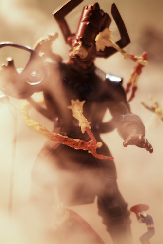
Despite what recent movies would have you believe, Galactus is no mere cloud of rock and dust. He is a being of immeasurable power and as old as the universe itself. Silly Fantastic Four movie.
Here we see Earth's greatest heroes struggling to save the planet (and everything on it) from being eaten by a dude in a giant purple hat. By bringing the line of sight lower, I tried to reinforce the idea that this is a BIG fight and there's really nothing we could do to stop it. By making them look bigger, it makes us look smaller? Something like that.
I placed a desk lamp with a 25 watt orange bulb in the top left corner and my reflector (this time crumpled aluminum foil) in the bottom right, hit the smoke machine, and snapped like mad. This is actually really close to how it came out of the camera. I didn't have to crop it at all and only did very minor tweaks to the color and contrast.
EXIF hungers!
| Camera: | Fujifilm FinePixS2Pro |
| Exposure: | 0.1 sec (1/10) |
| Aperture: | f/1.8 |
| Focal Length: | 50 mm |
| ISO Speed: | 100 |
| Exposure Bias: | 0/100 EV |
| Orientation: | Horizontal (normal) |
| X-Resolution: | 72 dpi |
| Y-Resolution: | 72 dpi |
| Software: | Adobe Photoshop CS3 Windows |
| Date and Time: | 2008:01:09 16:23:21 |
| Tag::TIFF::0x882A: | -6, -6 |
| Exposure Program: | Normal |
| Date and Time (Original): | 2008:01:09 16:14:54 |
| Date and Time (Digitized): | 2008:01:09 16:14:54 |
| Shutter Speed: | 3321928/1000000 |
| Brightness: | 50/100 |
| Metering Mode: | Center Weighted Average |
| Light Source: | Daylight |
| Color Space: | Uncalibrated |
| Focal Plane X-Resolution: | 630 dpc |
| Focal Plane Y-Resolution: | 630 dpc |
| Sensing Method: | One-chip colour area sensor |
| Exposure Mode: | Auto bracket |
| White Balance: | Manual |
| Focal Length In 35mm Film: | 75 |
| Saturation: | High saturation |
| Compression: | JPEG |
| Image Width: | 2024 pixels |
| Image Height: | 3024 pixels |
Be good,
-Dave
|


6:17 PM by
El Dave
, under

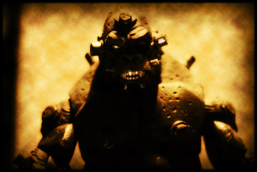
I've shot the Abomination before, but he never seems to turn out quite right. I'm usually happy with the pictures overall, but there's always something just a little...off. Not sure what though.
Just as a little background, the Abomination is one of the Hulk's bad guys. I'm sure you could guess by the giant green guy with tiny pants and a simplistic name, but that's what I do. I'm a giver. The majority of Hulk's early stories revolved around him trying to find solitude in the deserts of the American southwest, only to be rudely interrupted by the US military, the Avengers, or, in this case, the Abomination.
I tried to create the feeling that we're looking through the eyes of some poor sap who crossed Abomination on a bad day and he's looming over, about to finish us off (but not before we're rescued by a timely superhero, natch). I was trying for a "high-noon" look with harsh light and dusty colors, and tried something new that I will definitely be using again in the future. You see, I actually used a reflector to bounce light back up at the figure! Well, his teeth at least.
Hush; let me be proud of myself.
HULK SMASH PUNY EXIF DATA!
| Camera: | Fujifilm FinePixS2Pro |
| Exposure: | 0.5 sec (1/2) |
| Aperture: | f/1.8 |
| Focal Length: | 50 mm |
| ISO Speed: | 100 |
| Exposure Bias: | 1 EV |
| Orientation: | Horizontal (normal) |
| X-Resolution: | 72 dpi |
| Y-Resolution: | 72 dpi |
| Software: | Adobe Photoshop CS3 Windows |
| Date and Time: | 2008:01:08 20:14:20 |
| Tag::TIFF::0x882A: | -6, -6 |
| Exposure Program: | Normal |
| Date and Time (Original): | 2008:01:08 20:07:57 |
| Date and Time (Digitized): | 2008:01:08 20:07:57 |
| Shutter Speed: | 1/1 |
| Brightness: | -100/100 |
| Metering Mode: | Center Weighted Average |
| Light Source: | Daylight |
| Color Space: | Uncalibrated |
| Focal Plane X-Resolution: | 630 dpc |
| Focal Plane Y-Resolution: | 630 dpc |
| Sensing Method: | One-chip colour area sensor |
| Exposure Mode: | Auto bracket |
| White Balance: | Manual |
| Focal Length In 35mm Film: | 75 |
| Saturation: | High saturation |
| Compression: | JPEG |
| Image Width: | 2024 pixels |
| Image Height: | 2319 pixels |
Be good,
-Dave
|


5:02 PM by
El Dave
, under
A big thank you to my buddy Mr. David Price, the host of the Marvel Noise Podcast, for taking the time out of his busy schedule to say some really nice things about my work. Listen!
If you're a fan of comics, or even curious about Marvel Comics, I can't think of anywhere better to get your fix. Check him out here. Be sure to tell him El Dave sent you
|


11:00 AM by
El Dave
, under

Ye be off the map, matey. Here there be monsters
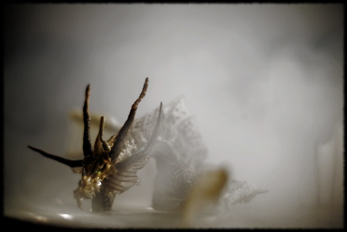
After the EVA-03 shoot, I had an itch to shoot some more water scenes and McFarlane's Water Dragon was just the figure I needed. I tried to create a more dream-like image, sort of how I imagine seeing the Loch Ness Monster must be like. Strangely blurred (Bigfoot is blurry!), but with surprising sharpness that burns into your memory and leaves you with a lifetime of questions. Or maybe I'm talking out my behind.
Setup for the shot is the same as the EVA-03, but with the fog machine going and the lip of the bowl standing in for a water ripple.
Thar EXIF blows!
| Camera: | Fujifilm FinePixS2Pro |
| Exposure: | 1 sec (1) |
| Aperture: | f/1.8 |
| Focal Length: | 50 mm |
| ISO Speed: | 100 |
| Exposure Bias: | 1 EV |
| Orientation: | Horizontal (normal) |
| X-Resolution: | 72 dpi |
| Y-Resolution: | 72 dpi |
| Software: | Adobe Photoshop CS3 Windows |
| Date and Time: | 2008:01:04 12:53:13 |
| Tag::TIFF::0x882A: | -6, -6 |
| Exposure Program: | Normal |
| Date and Time (Original): | 2008:01:04 12:47:28 |
| Date and Time (Digitized): | 2008:01:04 12:47:28 |
| Shutter Speed: | 0/1 |
| Brightness: | -183/100 |
| Metering Mode: | Center Weighted Average |
| Light Source: | Daylight |
| Color Space: | Uncalibrated |
| Focal Plane X-Resolution: | 630 dpc |
| Focal Plane Y-Resolution: | 630 dpc |
| Sensing Method: | One-chip colour area sensor |
| Exposure Mode: | Auto bracket |
| White Balance: | Manual |
| Focal Length In 35mm Film: | 75 |
| Saturation: | High saturation |
| Compression: | JPEG |
| Image Width: | 3024 pixels |
| Image Height: | 2024 pixels |
Be good,
-Dave
|


2:05 PM by
El Dave
, under
bane,
dc

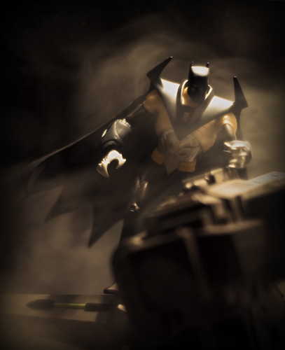
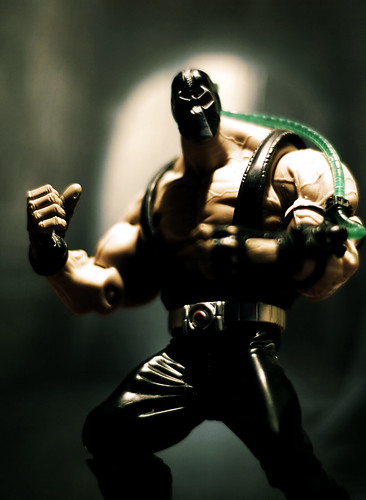
I have a weakness for the old Pulp-Era heroes: grizzled men who grab hold of the world with both hands and never let go. Bane was created as a modern version of Doc Savage, and I couldn't be happier with him. Though he's often used as the "heavy" in a story, Bane is fiercely intelligent and a cunning strategist. He's the only villain to not only take Batman, but force Bruce Wayne to pass the mantle on to another person. With a luchador-esque mask. Rock!
Shooting him was just a simple setup and click with him just standing in front of the backdrop. Color correction in Photoshop made him more interesting by combining a sepia overlay with the cool blues of the original photo and tweaking the contrast for drama. Really simple, but I am pretty happy about it.
We can't stop here, this is EXIF country!
| Camera: | Fujifilm FinePixS2Pro |
| Exposure: | 0.333 sec (1/3) |
| Aperture: | f/1.8 |
| Focal Length: | 50 mm |
| ISO Speed: | 100 |
| Exposure Bias: | 0/100 EV |
| Orientation: | Horizontal (normal) |
| X-Resolution: | 72 dpi |
| Y-Resolution: | 72 dpi |
| Software: | Adobe Photoshop CS3 Windows |
| Date and Time: | 2008:01:02 16:00:49 |
| Tag::TIFF::0x882A: | -6, -6 |
| Exposure Program: | Normal |
| Date and Time (Original): | 2008:01:02 15:58:57 |
| Date and Time (Digitized): | 2008:01:02 15:58:57 |
| Shutter Speed: | 1584963/1000000 |
| Brightness: | -166/100 |
| Metering Mode: | Center Weighted Average |
| Light Source: | Daylight |
| Color Space: | Uncalibrated |
| Focal Plane X-Resolution: | 630 dpc |
| Focal Plane Y-Resolution: | 630 dpc |
| Sensing Method: | One-chip colour area sensor |
| Exposure Mode: | Auto bracket |
| White Balance: | Manual |
| Focal Length In 35mm Film: | 75 |
| Saturation: | High saturation |
| Compression: | JPEG |
| Image Width: | 1480 pixels |
| Image Height: | 2022 pixels |
Be good,
-Dave
|


